folder_open Website Design
How Responsive Web Design Drives MagRabbit’s Software Developments
How Responsive Web Design Drives MagRabbit’s Software Development
Currently, the trend of using mobile devices such as smartphones and tablets for work as well as recreation is becoming increasingly popular, in fact, Google has announced that their search engine will give businesses with a mobile-friendly website design priority in search results as of April 21. This trend is accelerating because users can now conduct almost any task on a mobile device that formerly could only be executed on a desktop computer. As the ability to access the Internet on mobile devices is nearly equal to access on a desktop computer, mobile’s usefulness and convenience have a clear advantage.
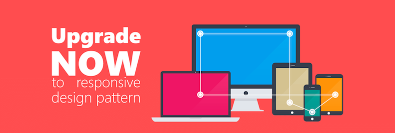
With a smartphone, users can check mail, search the web, and even do online shopping anywhere in the world. The fact that mobile Internet usage is significantly increasing requires developers to create mobile-friendly websites. In other words, we must develop websites compatible with both desktop and mobile devices, so we need the help of Responsive Web Design (RWD) - an approach of designing a website that is compatible with most screen sizes for easy reading and navigation.
Websites that have not been updated with responsive design are very difficult for users to access with mobile devices. A mobile phone’s screen cannot display the content of a web page as a desktop does; users must zoom in and out and scroll both vertically and horizontally to see the entire content of the web page. Meanwhile, a responsive website has content, images, and structure coded to appropriately adjust for different screen devices, meaning that a website that is viewable on a desktop will adjust to perfectly fit smaller screens like smartphones or tablets. As a result, developers do not need to create different versions of a website for separate devices, saving time and cost in development.
The 3 Essential Elements of Responsive Web Design
MagRabbit developers are designing websites with RWD by using the fluid grid, flexible images, and media queries to adjust the layout, images, and navigation of websites to accommodate many kinds of devices.
1. Fluid grid
As viewport height and width change from device to device, it is essential that the website adapts to this change. A fluid grid is an effective means that MagRabbit developers apply to design a responsive layout for a website. For example, website content that is shown in 3 column view on a laptop screen will display in 2 columns for tablets, while mobile users will only see one column on their devices. In order to gain the malleability and fluidity, our development team implements a fluid grid to size page elements into relative units of percentage rather than measure their width and height in pixels or inches. Thanks to relative values, we can identify suitable proportions for our website layout.
2. Flexible images
Images that the MagRabbit team designs in RWD are flexible images with diverse resolutions capable of a display from larger screens to smaller screen sizes. This will ensure that designs look sharp and eye-catching in all contexts bringing amazing experiences for users regardless of what device they are utilizing.
3. Media queries
With the help of media queries, our developers are able to specify styles for individual browsers and devices by using different CSS styles rules to create innovative style sheets based on the width, height, and color of viewports and device orientation.
In order to create a responsive web design, developers can refer to different support tools and Bootstrap is the typical tool that MagRabbit chooses for mobile projects on the web. Bootstrap is the most popular HTML, CSS and JS framework for developing responsiveness which allows developers to freely download UI elements, layouts, and javascript tools. Taking advantages of Bootstrap for RWD, the MagRabbit team has been designing websites whose layout automatically changes between different device screens. Responsive web designs with creative layouts, flexible images, and versatile styles will not disappoint users as they access the websites with a variety of devices. Additionally, our clients' benefit, as the development of a responsive website means that our developers only deploy one version of the website for all devices, saving development cost as well as time and resources for updating content afterward.
If your website is not mobile-friendly and your customers need a responsive website to access your business on their mobile devices, please don’t hesitate to contact us at info@magrabbit.com or +1 (512) 310-9903.
About MagRabbit
MagRabbit Inc. is a global software service provider with offices in Austin, TX, and Vietnam. Chairman and CEO, Tommy Hodinh launched MagRabbit in Austin, TX in 1990 and offers comprehensive supply chain management solutions and global IT consulting with an emphasis on providing cost-effective offshore software development services for startups.
